I have really enjoyed taking part in the 'New Elizabethans' project. My one concern beginning this project was my confidence and lack of makeup skills, as I have had no background in makeup training. I am really pleased with my progress, and feel my skills and techniques have developed well, as well as my understanding. The research into the Elizabethan Era and not just focusing on contemporary has really boosted my understanding and knowledge of makeup, which will support me throughout my career. After studying A-Levels in Art, Photography and English, I feel my research skills for those subjects have benefited me, as I have studied Queen Elizabeth and her famous look. I will continue practising throughout the Christmas break, as I know that practise makes perfect. The technical sessions with Sue have really benefitted me as I was a student that had never done any sort of makeup training before, just self taught. I feel I was successful in creating Amelia's design, which was defiantly supported by my teaching in art. I have found difficulty in deciding on a final design, but I am really pleased with the outcome, as my partner Amelia worked hard to complete it how I wanted it. My notes on the process helped guide her along, which I feel shows in the final outcome.
I have learnt so much during this single project, I am excited for what the next project holds!
Friday, 5 December 2014
Peer Review
Overall, I feel myself and my partner Amelia's designs were both reconstructed how we envisioned them. Through discussion, we conversed about what were the best products to use, and talked each other through the process of our designs. Our communication skills were put to the test when Amelia was absent for the practise sessions, leaving me without her design to practise whilst she was absent, and only one session to practise it on her. This was quickly resolved by swapping the groups, I was now group B and Amelia was then group A. My biggest concern with Amelia's design were the shapes of the eyeshadows, as they were not quite clear on the face-chart, but with teamwork and a lot of discussion and practise, we came to a decision. I am pleased with the outcome of my design, although I would have liked to have deeper contouring around the cheekbones, as this didn't show up too well in the final images. Amelia did a great job at covering the eyebrows and blending the eyeshadows, which were the focal point of my look. I feel I created Amelia's look exactly how she wanted it, at least I hope I did! Working with Amelia was good as we both guided each other towards the final outcome. I am sad this project is coming towards an end, as I have enjoyed it greatly!


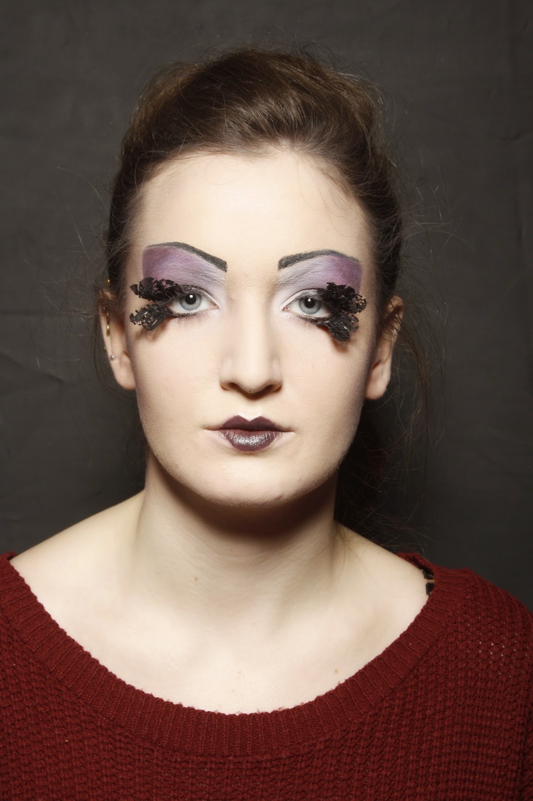
Thursday, 4 December 2014
Review of Final Looks
I am pleased with the outcome of the look for my final design. I feel Amelia responded to my design really well, and we worked together to find the right tools and experiment with techniques. For example, in the practise sessions we used Supra colour for the eyebrows in the first session, but it became clear that there had to be minimal product on the brush for a clean line, but minimal product meant a less stronger pigment. We then decided to use a black eyeliner pencil, which Amelia was more comfortable with working with. I would have liked the contouring to be a little more defined, as I feel my partner was nervous about over-doing it with the purple colour.
I am really pleased with the outcome of my work, using Amelia's design. The design was colourful and included a lot of blending, which I feel went really well in the assessment. I feel the look was successful, particularly the contrast between the bolder application of colours (blue,golds) to the subtle purple tones under the eyes. I was confident with the blocking of the eyebrows as I have practised this the most, as I feel a clear, even base is the most important part of creating a look. I have managed to conceal the eyebrows using glue, and worked over them in the eyeshadows to blend them away. I feel the least successful part of this look were the eyebrows, as I had trouble making them completely symmetrical, especially under the time pressure. Amelia's design challenged me, but I feel I have managed to complete the design just as Amelia had envisioned it.

Final Assessment
Makeup Artist: Georgia Warwick, Designer: Amelia Kildear


Makeup Artist: Amelia Kildear, Designer: Georgia Warwick.


Practising Amelia's look.
I am very pleased with the outcome of this look, as this was my first practise at it. I completed the look in the same time as the assessment will be, which boosted my confidence for when I am completing this look on the day. I feel I was least successful in applying the white supra colour to under the eyes, as this was tricky due to the skin pulling under the eye, creating uneven lines, when Amelia wanted clean lines. found the eyebrows particularly difficult, not the application but trying to make them completely symmetrical, so I did a little bit at a time on each eyebrow. In this practise, I didn't apply enough glue to the eyebrow to fully cover the inside edge of the brow, but I know that is what I have to do next session.


Tuesday, 25 November 2014
Practice Sessions

This is my design completed by my partner in the practise sessions. I am very pleased with the outcome of the makeup, particularly the symmetry of the look. We still needed to add the eyelashes, but decided not to use them in the practise session, to reduce the chance of them breaking as they are very fragile. Whilst talking about the look, we came to a decision to use glue instead of the soap and water technique, as my partner, Amelia, feels that this would be the her strongest technique out of the two. We also practised using two different methods of applying the eyebrows, the first product used was the supra colour in black, using an angled brush, and the second product was using an eye/lip pencil. When using the pencil, the application was much smoother with much less excess product smudging across the eye, but is still just as black as the supra colour. We conversed about the angles of the eyebrows and the shape of the eye shadow, and how I wanted them to be completed, which my partner has done well in the process. I

Wednesday, 19 November 2014
Finalising my design
After studying the work of Pat McGrath's makeup for John Galliano, I have been inspired to carry forward the purple colours into my final piece. I was particularly taken aback by the lips, the shape is so perfectly defined on the top lip, which is highlighted by the silver outline on the cupid's bow. McGrath's makeup is a big reason why I wanted to become a makeup artist, she has always been very influential and creative with her designs. She manages to combine both definition and softness, as well as bold and light colours. Her work is very arty, especially this look for John Galliano.


 |
| Makeup Artist: Pat McGrath John Galliano Spring/Summer 2010 Vogue |
She has drawn on the eyebrows over the top of her models, and she hides them underneath the mass of messy but perfect silvers and purples. There is definite Elizabethan influence in this makeup, the eyebrows are hidden and drawn back on over the smudged, coal-black eyes and the bold lips. The base is also very pale, but is not a ice-white, but a very pale shade of nude.
Final Design
My final design is a mixture of my designs, moulded into one. I wanted to continue with the purple theme, as I feel the red and black theme was very obvious for the task. My New Elizabethan look will be on a base of a very light foundation, a mixture of the Kryolan Foundation Palette and the White Skin Base. This look consists of strong contouring of the cheekbone using 'Shallot' from the Brilliant Colour Palette and the Brown from the Blush Palette by Kryolan, instead of the traditional, circular blush of the era. I want to bring the contour down to the jaw slightly, so that the bottom part of the face isn't bare. This contouring will continue onto the top of the forehead just at the sides, which will elongate my forehead, as the Elizabethans wanted long foreheads as this was a sign of intelligence and aristocracy. The eyebrows will be blocked out using glue, and a purple gradient will fill the space between the eye and brow, and on top of the brow to further conceal it. The eyes will be drawn back onto the face, using the Supra Colour by Kryolan in black, which will exaggerate the illusion of a high forehead. The eyelashes will be black lace, as the Elizabethans wore a lot of lace, especially the wealthier ladies. I feel by incorporating lace will add another texture to the look, but also links their costume to this makeup. The lips will be MAC Lip Mix in a mixture of the red and blue to create a deep plum colour. This will be outlined by the shimmer lipstick mixed with the gold Supra Colour, to define the look.
I have studied the 'Makeup Is Art' Book by The Academy Of Freelance Makeup, finding my inspiration and also tips on how to create my look. This book has supported my experimentation of products and method, particularly in the contouring and the application of fake eyelashes. As these are two very essential aspects to my design, I have used this book to study.
Reference: Makeup Is Art, AOFM Pro
Timelapse of myself practising the look:
Final outcome:
(Still need the eyelashes)
I am really pleased with the outcome of my design. I need to work on being precise with the eyebrows and them being symmetrical. I am pleased with the contrast of the tones, the bold lips and eyebrows balance out the features, and I think the eyelashes will really tie the design together. I am pleased on the progress of myself blocking the eyebrows, I am beginning to be able to conceal them more.
In class I practised blocking the eyebrows and blending the eyeshadow over the glue, as the glue doesn't pick up the pigment as much as the skin.
I feel this is effective due to the shapes of the shadow, elongating my forehead. I think the blending has worked well, and the eyebrows are very close to being concealed completely!
Practising Blocking Eyebrows
At home I have been practising blocking out eyebrows, for my final assessment.


 I need to work on blending the colour over the eyebrow whether the glue is. The glue doesn't pick up the pigment as much as I would like it too, so I need to figure out a way to create an even, flawless coverage.


I am happy with the outcome of this, as I feel my techniques are developing well. I need to work on the coverage and blending over the eyebrow so will keep practising!
Using glue, I have managed to hide my eyebrows. I practised with drawing on different shapes, both with high arches, much like the Elizabethan's eyebrows! I need to work on the use of cancelling out the colour of my eyebrows as I have dark and thicker eyebrows. I can do this by using a red concealer from the Camouflage palette by Kryolan, and powdering, then adding the skin base on top. Below I have used concealer on the left eye, but not the right, and there is a clear colour difference where the eyebrow is. On the right, the dark hairs can still be seen, whereas on the left, the hair cannot be seen as much.
In class, we have been practising blocking out the eyebrows as well. On my model Amelia, I have used a very light Foundation mixed with the skin base. I prepped the skin, and used toner on the eyebrows to remove any excess grease. I used soap in this glue in this practise, which I prefer to the soap method. I will be using the glue method in my final design, as I feel I can create a much more hidden brow to the soap.
I am happy with the outcome of this, as I feel my techniques are developing well. I need to work on the coverage and blending over the eyebrow so will keep practising!
Developing Face Charts
In a tutorial with Kat, I decided to work on developing my first two makeup face charts in aim to finalising my New Elizabethan look. I need to work on taking my idea a step further, and create an original look. I have explored the colour well, and my designs show Elizabethan influence.


At home, I began to practise the looks that I had used on my face charts, and experimenting with some other ideas. This look was based on my initial face chart, but I added the point from the corner of the eye downwards to contrast against the soft blush/contour. I blocked out the eyebrows, and worked on blending the colour to create a soft look, much alike Pat McGrath's looks. I used the Kryolan Brilliant Colour Palette against the Illamasqua SkinBase, and then defined the eyebrow using the Supra Colours in Black. I feel this look is effective, but I would like to have a bold lip, as the rest of the face is very colourful.

This look was based on my third design, which I think has a Mod feel to it. The curve connecting the eyebrow to the cheekbone both highlights and defines both elements. I will not be using this in my final design as I don't feel it suits the brief, but I am happy I have experimented as I have developed my techniques.

This was my last experiment. I really enjoyed this idea as it was completely off the top of my head, as I was able to experiment with new textures. I used fishnet tights and Snazaroo face paint in silver, then sealed with white powder to give a shimmer effect. I contrasted this with a completely black eye, with black root-like veins reaching up my forehead. I liked this design as I believe it was effective, but I don't feel it relates to the New Elizabethan theme as much as my other ideas.

In class I practised with using sticky tape to create sharp lines of contouring.

I experimented with having the two colours butting, and also leaving a gap between them.
I prefer the lines being immediately next to each other, as I feel it's much more effective in creating a shadow, rather than being disjointed.


I need to work on my work being symmetrical, as here, the eyebrows and the points coming down from the eyes are not quite even. I need to practise further in developing my idea, as I am still not quite happy with it.
Designs and Influence
When producing my designs for my New Elizabethan, I had to take any things into consideration. My aim was to be as experimental as I could, but with clear influence from the Elizabethan Era. My first design was influenced by Pat McGrath's soft but vibrant look on model Eva Jay Kubatova, by Steven Meisel for Vogue Italia, February 2002. I admired how the luminous colours were blended so evenly onto the skin, creating a smooth, gradual shape. The focus of this image is clearly on the makeup, as it stands out in the photo, whilst her hair, skin and clothes are all of a sepia tone, which contrasts against each other. The use of joining the colour on the eye to the cheeks was a technique that I wanted to use in my design, as the makeup flows and isn't disjointed.

This was my second idea for the makeup for my New Elizabethan. I used design 1 as a basis, using the same joining eye and cheek makeup, but made the contouring much more extreme and sharp, making this more contemporary than the rounded blush of the Elizabethans. This sharpness contrasts against the soft powdery look that I was achieving by using the powder products rather than the wet/grease products. Once again I would block the eyebrows out, and draw them back on very thinly like the Queen did herself. I would use a monochromatic purple colour scheme, to add a contemporary feel to the piece. The lips would be a deep plum colour,which would be balanced out by the black shadowing of the eye socket. I would like to develop this idea further, and experiment with shape of the eyeshadow.
 |
| Makeup Artist: Pat McGrath Stylist: Lori Goldstein Hair: Orlando Pita Photographer: Steven Meisel Model: Eva Jay Kubotova http://forums.thefashionspot.com/f109/vogue-italia-february-2002-eva-jay-kubatova-steven-meisel-70583.html |
I particularly liked this design, as I used the colours of the Elizabethans; red, white and black. These colours work well together because of the contrast, much alike the contrast of the neon pink and oranges in McGrath's work. For this design I would block out the eyebrows using the glue technique, instead of plucking them out like the Elizabethans did. The eyebrows would then be drawn on very arched and thin, as this was a sign of aristocracy and intelligence. I wanted this makeup to have extreme contouring on the cheekbones, which would be enhanced by the contrast of the red above the cheek bones. The base of the skin would be a mixture of the lightest shade on the Kryolan Foundation Pallete and the Illamasqua Skin Base. This would add a contemporary twist, as the Elizabethan's aimed for a pure white face. The lips would be in a dark red compared to the berry-red that the Elizabethans wore, which further makes this design more contemporary. I feel this design is quite safe, but think I could push myself further to enhance this more.
Another influence of my designs is this makeup by Hyea W. Kang for Vogue Korea, in October 2002. Once again the makeup is very soft and blended perfectly on the face, so that the colour seeps into one another rather very naturally, rather than being very forced and disjointed. I particularly like the white paste that outlines her face and is dragged down the neck, as it brings a messy element to the very soft powdery look, contrasting these two techniques.
 |
| Makeup : Hyea W. Kang Vogue Korea, October 2002. somethingvain.tumblr.com  |
When searching for inspiration on Pinterest, I stumbled upon this image, by and unknown makeup artist. I was immediately drawn to the boldness of the eyes and their contrast against the nude face. The eye is really drawn towards the eyes of the model, and seeing as Elizabeth yearned to have the attention of people for her beauty, this seemed like a very good basis for my design.
I wanted to use this image as a basis for my work. I decided to make this design more bold with the use of the hard black line. As I wasn't sure about whether to join the line up, I split the face chart in half and completed two designs. The left side I prefer to the right, purely because I don't feel by joining the line I achieve anything. The shape roughly creates a heart-outline, a shape that was used particularly for the hair of the Elizabethans. The base of the skin would be a pale white, just like Queen Elizabeth herself, which creates a really high contrast of the shapes of the eyes and the lips.


 |
| Unknown Makeup Artist/Photographer |
My last design was experimenting with shapes further. I wanted to see how I could use shapes to produce a contemporary design, and use the original Elizabethan colours, red, black and white. This design I particularly like based on the sharpness of the lines, which would be a complete change from the rounded and soft blush of the Elizabethans.
Subscribe to:
Posts (Atom)